
I was recently on a call in which a client asked, “What would you change about our homepage?”
Although it’s a fair question in broad terms, there’s some danger in reacting and responding with our gut instinct, even if we have a measure of experience or authority.
Here’s a potentially unpopular perspective: what you or I think may not matter as much as we’d like. Going with your gut may lead you down the wrong path unless you happen to be within one of your own target persona categories. But — sorry to say — even in those rare cases, if you’re reading this blog, your perception may already be skewed.
The issue here is bias. Although we could explore a dozen that could be in play, here are two of my favorites that can cause us to paint a potentially inaccurate picture of how a website truly performs:
Cognitive bias: salience availability
Salience availability involves the brain’s tendency to focus on facts that prove their personal beliefs regardless of the truth. In the context of website analysis, this may lead to being convinced that our own impressions represent the experience of all users. In our life science niche, this can represent a real risk to the business goals of a website, since the internal team’s perception and usage of the site may be very different from how their intended audience (especially specialized groups such as patients or HCPs) perceives its messaging and usefulness.
Confirmation bias
Confirmation bias is our cognitive rabbit hole. We’re more apt to analyze information in a way that confirms and conforms to our existing beliefs and skip or ignore details that contradict our view, even if the information is factual. When examining websites, we run the risk of pursuing data analysis in ways that are shaped by the blogs or how-tos we’ve most recently read, the skills in our wheelhouse, or how we think the site should be performing, which can limit the true and complete picture.
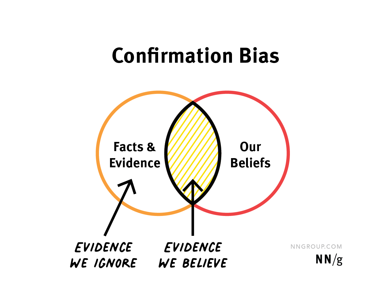
Source: Confirmation Bias in UX, Nielsen Norman Group
Most importantly, confirmation bias means we’re more likely to believe the evidence that “the site works fine” if we’ve been heavily invested in its design over the last month, and be skeptical about any findings that show problems with the user interface.
Thankfully, there are proven methods to cut through the noise. Here are three pieces of the process to consider:
1. Objective data analysis
Those performing an analysis of user interaction data should begin with an open mindset. Minimize hypotheses, and approach the data with the intent of discovering and uncovering patterns, not validating assumptions. Good data analysts will prepare unbiased queries for data interrogation, and be ready to pause and pivot if they find themselves drawn into self-validation. By objectively analyzing user behavior and site performance from a variety of sources, we can paint a truer picture of the site’s strengths and weaknesses.
2. Segmentation and persona building
It’s unrealistic to expect that everyone who visits your site has the same needs, intent, and experience. You know the audience segments you’re trying to reach, so why wouldn’t you evaluate the effectiveness of your website for each group? Although in some ways it’s difficult to distinguish and categorize site visitors in our industry, there are still a variety of ways to segment them for better pattern analysis: How did they get here? Where did they land? What pages did they visit? By their navigation patterns, are they showing you they’re likely to be career/job seekers, or investors, or patients? Are they new or returning? Did they view a particular product info page or instead go straight to the support section? Untangling visitors and analyzing them in segments can provide more specific trend data, which can guide better conclusions about what to improve for each group (without cannibalizing an invaluable feature for others).
3. A/B Testing
Once you’ve gathered data, analyzed it objectively, and segmented your audience for user-specific insights, you’ll want to make changes to the site based on what you’ve uncovered. However, it’s critical to incrementally test your changes methodically to be sure you’re making a positive, meaningful change. Again, we’re relying on data to measure success. Eventually, a well-designed series of split tests will result in a much better user experience — or will give you solid evidence to revert a negatively impactful change.
The ultimate answer, of course, is that every website does have room to improve. But to do so responsibly — for your audience and your bottom line — means avoiding personal biases as much as possible by leveraging data to define and measure true improvement.